
Introduction
Choosing the right Product Photography Background is an important part of creating professional product images that attract attention and communicate value. The background influences how customers perceive a product, how clearly its details appear, and how well the image fits your brand identity. Whether you sell fashion accessories, cosmetics, electronics, home décor, food products, or handmade items, the right background can make your photography more effective.
A suitable background does more than make a photograph look attractive. It helps separate the product from its surroundings, supports consistent branding, and ensures that important details remain visible. A background that is too busy, too dark, or too similar to the product can distract viewers and reduce the impact of the image.
For e-commerce businesses and brands investing in professional product photography, understanding background colours, textures, materials, lighting, and composition can improve the quality of their visual content. In this guide, we explain how to choose the right Product Photography Background for different products, marketing platforms, and business objectives.
1. Understand Your Product Before Selecting a Background
The first step in choosing a Product Photography Background is understanding the product itself. Its colour, material, size, shape, texture, and intended audience all influence which background will work best.
A white background may be ideal for a clean catalogue photograph, while a textured surface could be more suitable for a lifestyle image. A premium perfume bottle might benefit from a dark, elegant setting, whereas colourful stationery could stand out against a simple neutral backdrop.
Consider Product Colour
Look at the product’s dominant colours before selecting the background. A light-coloured product can disappear against a similar light surface, while a dark product may lose its outline on a dark background.
Choose a contrasting or complementary colour that keeps the product clearly visible without creating unnecessary visual competition.
Identify the Product Material
Glass, metal, fabric, wood, plastic, and ceramics respond differently to lighting and backgrounds. Reflective products may show unwanted reflections, while textured materials may benefit from a surface that complements their natural appearance.
Understand the Intended Customer
The background should support the expectations of your target audience. Luxury products may suit sophisticated, minimal compositions, while playful consumer products can work well with brighter colours and creative props.
Define the Photograph’s Purpose
A catalogue image, social media advertisement, website banner, and lifestyle photograph may require different visual treatments. Decide what the image needs to communicate before choosing the background.
2. Choose Between White, Neutral, and Coloured Backgrounds
Background colour can change the overall mood of a product photograph. The right choice depends on the product, brand guidelines, intended platform, and whether the image needs to communicate information or create an emotional response.
White Backgrounds for Clean Product Images
White is a common choice for catalogue photography because it provides a clean, uncluttered appearance. It can help customers focus on product shape, colour, packaging, and details.
However, white is not automatically the best choice for every product. White objects can lose definition against a bright white background unless the lighting and shadows are carefully controlled.
Neutral Backgrounds for Versatility
Beige, grey, cream, and other muted shades can create a sophisticated appearance while keeping attention on the product. Neutral backgrounds are useful for beauty products, fashion accessories, home décor, and many lifestyle brands.
Coloured Backgrounds for Brand Personality
A carefully selected colour can reinforce a brand’s visual identity or help a product stand out in a crowded social media feed. Bright backgrounds may suit energetic brands, while deeper shades can create a more dramatic presentation.
Use Contrast Carefully
Contrast helps separate the product from the background. The goal is to make the product easy to recognize, not to create a colour combination that overwhelms the image.
3. Match the Background to Your Brand Identity
A Product Photography Background should support the brand’s visual identity rather than be selected in isolation. Consistency across product images helps create a recognizable appearance on your website, online store, social media profiles, and promotional materials.
Before a photoshoot, review your existing brand colours, packaging, website design, and marketing assets. This can help you select backgrounds that work with the wider visual system.
Follow Your Brand Colour Palette
Choose background shades that complement your established colours. You do not need to use the same colour in every photograph, but the overall collection should feel connected.
Consider Your Brand Positioning
A premium brand may use restrained colours, refined textures, and carefully controlled lighting. A youthful or playful brand may use brighter colours, stronger contrast, or more expressive compositions.
Create a Consistent Visual Style
Decide which background styles will be used for catalogue images, lifestyle photography, promotional campaigns, and seasonal content. A consistent approach makes your visual assets easier to organize and reuse.
Avoid Overusing Brand Colours
Using brand colours can reinforce identity, but applying them to every surface may reduce product contrast. Sometimes a neutral background provides a better presentation while other visual elements carry the brand identity.

4. Use Textured Backgrounds to Add Depth and Character
Textures can make product photographs feel more tactile and visually interesting. They are especially useful for lifestyle imagery, handmade products, natural skincare, food products, furniture accessories, and artisanal goods.
The key is to choose a texture that supports the product without competing with its important details.
Wood for Warmth and Natural Appeal
Wooden surfaces can complement handmade products, home décor, organic skincare, food styling, and rustic product concepts. Different wood finishes create different moods, from light and contemporary to darker and more traditional.
Stone and Marble for a Refined Look
Stone, concrete, and marble surfaces can work well for cosmetics, jewellery, fragrance, premium accessories, and modern home products. Their patterns should be subtle enough to keep the product as the main subject.
Fabric for Softness and Lifestyle Styling
Linen, cotton, and other fabrics can create a softer setting for fashion accessories, beauty products, and home décor. Check that folds and wrinkles do not distract from the product.
Paper and Painted Surfaces for Creative Flexibility
Coloured paper, painted boards, and matte surfaces are relatively versatile options for controlled product photography. They can provide a consistent appearance and are useful when a campaign requires several background colours.
5. Select the Right Background for E-commerce Product Photography
E-commerce images help customers evaluate products before making a purchase. A suitable background should keep the product clear, present its details accurately, and support a consistent shopping experience.
The appropriate style depends on the retailer’s image requirements, the product category, and the role of each image on the product page.
Use a Consistent Catalogue Style
A consistent background, camera angle, and lighting setup help customers compare products within the same collection. This is particularly useful when an online store contains many colours, sizes, or product variations.
Keep the Product Easy to Inspect
Avoid props and patterns that hide important details. Customers should be able to see the product’s shape, finish, components, and relevant features.
Follow Marketplace Image Requirements
Different marketplaces and retailers may have specific requirements for backgrounds, cropping, image dimensions, and the presence of additional objects. Check the current guidelines for each destination before the shoot.
Add Lifestyle Images Where Appropriate
Clean catalogue images can be complemented by photographs showing the product in use. These additional images help customers understand scale, context, and possible applications.
Maintain Accurate Product Colours
Lighting and background reflections can influence how colours appear. Use controlled lighting and review the final images to reduce unwanted colour casts and misleading representations.
6. Choose Backgrounds That Work With Product Lighting
Background selection and lighting should be planned together. A background that looks suitable in isolation may appear too bright, too dark, or uneven once the lights are positioned.
The reflective properties of the product and the background material can also affect the final image.
Control Shadows
Shadows can add depth and help a product feel grounded. However, harsh or distracting shadows may obscure details. Adjust the position and size of light sources to achieve the desired effect.
Avoid Unwanted Reflections
Glass, polished metal, glossy packaging, and reflective plastics can pick up surrounding colours and equipment. Matte backgrounds and careful light placement can help control these reflections.
Separate the Product From the Background
Use differences in brightness, colour, focus, or lighting to make the product stand out. A small adjustment to the light position may improve separation without changing the background itself.
Test Before Photographing the Full Collection
Take a few test shots and inspect them on a suitable display. Check the product outline, background uniformity, shadows, reflections, and colour accuracy before proceeding with the full shoot.
7. Select a Background Material That Suits Your Shoot
The physical material used for a background affects its appearance, durability, cleaning requirements, and ease of setup. Choosing the right material can save time during production and make it easier to achieve consistent results.
Paper Backdrops
Paper backgrounds provide a smooth, relatively uniform surface. They are useful for clean catalogue images and simple colour-based compositions, although they can be damaged by liquids, dirt, or heavy objects.
Vinyl Backgrounds
Vinyl can be useful when a wipeable surface is required. It is available in various colours and finishes, but reflective vinyl may need careful lighting to prevent glare.
Fabric Backgrounds
Fabric can provide soft textures and is easy to transport, but wrinkles may become visible in the final image. Steaming, stretching, or carefully arranging the material can improve its appearance.
Acrylic and Glossy Surfaces
Acrylic sheets can create clean, reflective product presentations. They are suitable for selected cosmetic, fragrance, jewellery, and electronics concepts, but fingerprints and unwanted reflections need attention.
Wooden and Stone Surfaces
Wood, stone, and concrete boards can add texture and weight to a composition. They are useful when the background should contribute to the product’s lifestyle or premium positioning.
8. Use Minimal Backgrounds for Small and Detailed Products
Products with intricate shapes, small components, or fine surface details often benefit from simple backgrounds. A cluttered setting can make these products harder to inspect and distract attention from the features that matter.
Minimal backgrounds are particularly useful for jewellery, watches, electronics, small accessories, beauty products, and precision-made items.
Keep the Composition Simple
Use only the elements required to communicate the product’s purpose or visual appeal. Remove unnecessary objects from the frame before shooting.
Make Fine Details Visible
Choose a background with sufficient contrast to reveal edges, textures, and small components. For reflective products, test the setup from several angles to identify the clearest presentation.
Control Decorative Elements
Props can provide context, but they should remain secondary to the product. Keep decorative objects away from important features and avoid overcrowding the frame.
Use Negative Space Effectively
Leaving empty space around the product can create a premium, uncluttered appearance. It can also provide room for advertising copy when the image is intended for a marketing campaign.
9. Choose Lifestyle Backgrounds That Tell a Story
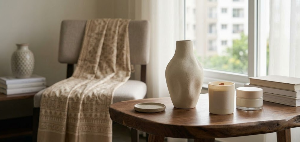
Lifestyle product photography places an item in a setting that helps viewers imagine how it fits into everyday life. Instead of showing only the product, the photograph communicates its use, atmosphere, or relationship to the intended customer.
This approach can be particularly effective for home décor, fashion accessories, food, beauty products, fitness equipment, and consumer lifestyle brands.
Match the Setting to the Product
A kitchen setting may suit cookware, while a bedside table could work for a reading lamp or skincare product. Choose a location that feels relevant to the product’s purpose.
Keep the Scene Believable
The setting should look natural and practical. Avoid props that imply uses the product cannot support or create a misleading impression of its size or performance.
Balance Context and Visibility
The environment should add useful context without making the product difficult to identify. Position the product where it remains a clear focal point.
Plan Background Continuity
If several images belong to the same campaign, maintain consistency in lighting, props, and styling. This helps the photographs work together across product pages, social media, and advertisements.
10. Avoid Common Product Photography Background Mistakes
Even a good product can look less appealing when the background is poorly selected or prepared. Reviewing the scene before shooting helps prevent avoidable editing work and creates a more professional final result.
Backgrounds That Match the Product Too Closely
When product and background colours are too similar, the edges may become difficult to distinguish. Adjust the background shade or lighting to restore separation.
Distracting Patterns and Props
Busy patterns, strong textures, and unnecessary accessories can compete with the main subject. Remove elements that do not support the photograph’s purpose.
Visible Dirt, Wrinkles, and Scratches
Dust, fingerprints, creases, and surface damage may become highly visible under studio lighting. Clean and inspect the background before photographing the product.
Inconsistent Backgrounds Across a Collection
Using different lighting, camera positions, or background shades for similar products can make an online catalogue look inconsistent. Create a repeatable setup for product collections.
Unnatural Colour Casts
Strongly coloured surfaces may reflect colour onto the product, especially on glossy or light-coloured objects. Check the test images and adjust the setup when the product’s appearance is affected.
Overediting the Final Image
Editing should improve the photograph without making the product misleading. Preserve accurate colours, realistic textures, and important product characteristics.
11. Adapt Product Photography Backgrounds for Different Platforms
The same product may need different images across an e-commerce website, Instagram, paid advertisements, email campaigns, and printed marketing materials. Planning these requirements in advance can reduce the need for additional shoots.
A background should support the intended format while preserving the product’s clarity and brand consistency.
Website and E-commerce Product Pages
Use backgrounds that make product details easy to inspect and align with the website’s visual style. Keep the product clearly visible at the sizes customers are likely to view.
Instagram and Social Media
Social content may allow more creative colours, textures, lifestyle settings, and visual storytelling. The background should still support the message and remain consistent with the brand.
Paid Advertising Campaigns
Advertising images may need additional negative space for design elements. Coordinate with the marketing team before shooting so the composition supports the final layout.
Website Banners and Promotional Graphics
Wide banner layouts may require the product to be positioned to one side, leaving space for headlines or design elements to be added later. Confirm the required dimensions and crop before the shoot.
Create Multiple Versions When Necessary
One carefully planned shoot can produce clean catalogue images, lifestyle photographs, and promotional variations. Capture the required angles and background options while the setup is ready.
12. Build a Repeatable Background Selection Workflow
A repeatable workflow helps businesses choose backgrounds efficiently and maintain consistent photography as their product range grows. Instead of making every decision from scratch, document the choices that work for each product category and marketing purpose.
Create a Background Reference Guide
Record preferred background colours, materials, lighting arrangements, camera angles, and styling approaches. Include reference photographs to help the production team recreate the setup.
Group Products by Photography Requirements
Products with similar sizes, colours, and materials may be photographed together using a shared setup. This can reduce setup time and improve consistency.
Test Before the Main Shoot
Photograph a sample product and review the result before moving on to the full collection. Confirm that the background works with the product’s colour, finish, and shape.
Maintain an Organized Background Library
Label and store reusable boards, paper rolls, fabrics, and props so the team can find suitable materials quickly. Keep backgrounds clean and replace damaged surfaces when necessary.
Review Results and Refine Your Choices
Assess how the photographs perform across your website and marketing channels. Use customer feedback, campaign results, and brand requirements to refine future background selections.
A documented workflow makes it easier to brief photographers, repeat successful setups, and produce a consistent collection of product images.
How MWS India Can Help With Professional Product Photography
Choosing the right background is only one part of producing effective product images. Lighting, camera settings, styling, reflections, composition, and post-production all contribute to the final result.
MWS India supports businesses, e-commerce brands, and product-based companies looking for professional content production in Mumbai. Depending on your requirements, a product photography project can include background planning, product styling, controlled studio lighting, catalogue photography, lifestyle images, and supporting visual content.
Background Selection and Styling
A planned shoot considers the product’s material, colour, intended audience, and brand identity before selecting suitable background surfaces. This helps maintain product visibility and a consistent visual direction.
Professional Studio Photography
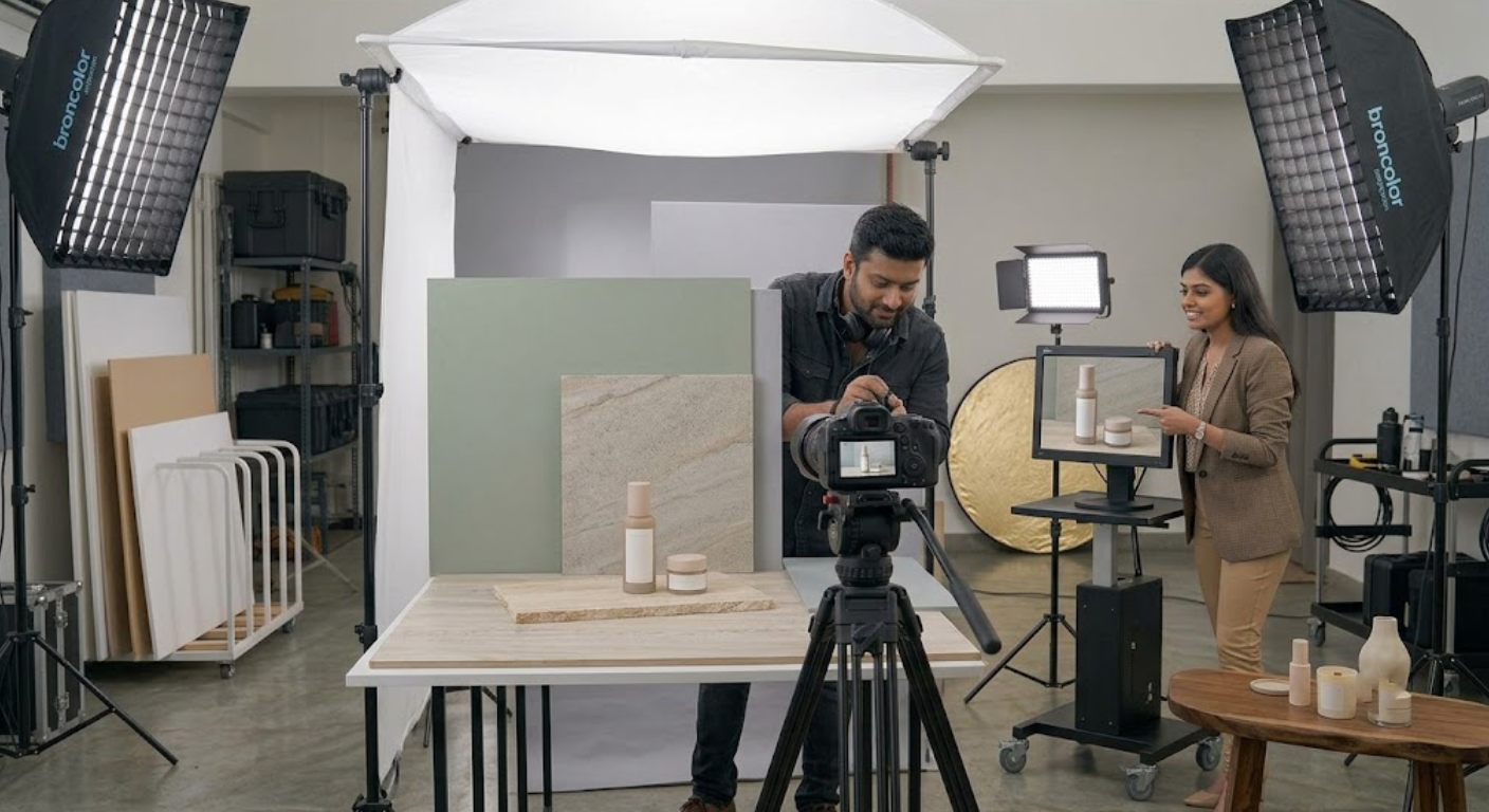
A controlled studio environment provides greater flexibility when adjusting backgrounds, lighting, camera positioning, and product placement. It is particularly useful for reflective objects, detailed products, and large product collections.
E-commerce and Catalogue Images
Consistent backgrounds and repeatable camera setups can help create a coordinated product catalogue. Images can be planned according to the requirements of the website or marketplace where they will be published.
Lifestyle and Promotional Photography
Lifestyle setups can show products in relevant environments, while promotional compositions may leave space for campaign design and advertising layouts.
Content for Multiple Marketing Channels
A well-organized shoot can capture different angles, close-ups, and background variations for use across product pages, social media, and other marketing materials.
If your business needs professional product photography in Mumbai, MWS India can help plan a shoot that aligns background choices, lighting, styling, and final image requirements with your brand’s visual goals.
Conclusion
Choosing the right Product Photography Background involves understanding your product, selecting appropriate colours and materials, considering your brand identity, and planning for the intended marketing platform. White and neutral backgrounds can provide clean, versatile product images, while textured and lifestyle settings can add depth, context, and personality.
The most effective background is one that supports the product rather than competing with it. Test your options under the planned lighting, maintain consistent styling across collections, and ensure the final images represent your products accurately.
With a repeatable background selection process and professional photography techniques, businesses can create clear, consistent product images that strengthen their online presence and help customers understand what they are buying.