
When customers visit an e-commerce store, they experience the brand through more than its products. They also notice the product photographs, colours, typography, banners, page layouts, icons and overall presentation. Together, these elements influence how customers perceive the business and navigate the shopping experience.
A store may offer excellent products, competitive prices and useful features, but inconsistent visuals can make the website feel disconnected. For example, product images with different backgrounds, promotional banners with unrelated colour schemes and product pages with inconsistent layouts can create an unorganised appearance.
Learning how to create a consistent visual experience across your e-commerce store helps businesses establish a recognisable identity and present their products more professionally.
Visual consistency does not mean making every page look identical. The objective is to create a unified design system that allows product categories, promotional campaigns and individual pages to serve different purposes while still feeling connected.
For example, a jewellery store may use elegant typography, carefully controlled lighting and refined product photography. A stationery store may prefer brighter colours, playful graphics and clean product arrangements. Both approaches can work when the design decisions follow a consistent visual direction.
MW Stuudio provides e-commerce product photography and e-commerce development services that businesses can explore when planning or improving their online stores.
Here are 15 practical ways to create a more cohesive, professional and user-friendly visual experience across your e-commerce website.
1. Establish a Clear Visual Identity for Your Store
Before changing individual product pages or banners, define the visual identity you want your store to communicate.
Your visual identity should reflect your products, target audience, brand personality and market positioning. A premium fashion store may need an elegant, restrained appearance, while a children’s stationery store might benefit from a brighter and more energetic style.
Start by defining the main elements of your brand:
- Primary and secondary brand colours.
- Heading and body font styles.
- Photography direction.
- Button and icon styles.
- Background colours and textures.
- Graphic elements and decorative patterns.
These choices should work together rather than compete for attention.
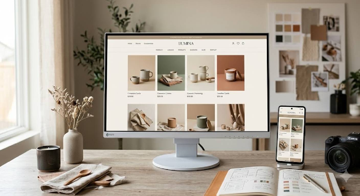
For example, a skincare brand using soft neutral colours and minimalist packaging should carry that same visual direction into its website banners, product cards and promotional graphics.
Create a simple reference document that explains these decisions. Include examples of preferred layouts, photography styles and colour combinations so that designers and content creators can follow the same direction.
A clear visual identity gives every future design decision a starting point. It also reduces the likelihood of unrelated styles appearing as the store grows.
2. Keep Product Photography Consistent Across Categories
Product photography is one of the most visible elements of an e-commerce website. Customers often compare multiple products directly on category pages, so inconsistent images can make the catalogue appear disorganised.
Consistency involves more than using high-resolution photographs. Product scale, background, camera angle, lighting and editing should follow a planned system.
For example, if a clothing store displays some garments against bright white backgrounds and others against dark grey backgrounds without a clear reason, the category grid may feel disconnected.
To improve consistency, establish photography guidelines for each product category.
Consider standardising:
- Background colour or background treatment.
- Product position within the frame.
- Camera angle and viewing perspective.
- Lighting direction and softness.
- Shadow treatment.
- Image dimensions and aspect ratio.
- Colour correction and retouching.
Different product categories may need different approaches. Jewellery photography, for example, may require close-up detail, while furniture photography may need wider compositions. The important point is to define a consistent approach within each suitable category.
MW Stuudio’s e-commerce product photography services can be explored by brands that need coordinated product images for their online catalogues.
3. Use a Consistent Colour Palette Throughout the Website
Colour influences how different sections of an e-commerce website relate to one another. When the same colour system appears across the header, buttons, banners, icons and promotional sections, the store becomes easier to recognise.
However, consistency does not require using the primary brand colour everywhere. Too much of one colour can make a page visually heavy, while too many unrelated colours can weaken the overall design.
A practical palette typically includes:
- Primary colour: Used for important brand elements and selected highlights.
- Secondary colour: Supports the primary colour and adds variation.
- Accent colour: Draws attention to selected actions or details.
- Neutral colours: Used for backgrounds, text and spacing.
For example, an art supplies store could combine a dark blue brand colour with a warm accent and light neutral backgrounds. Product photography can introduce additional colours without requiring every section of the website to use a different background.
Assign clear roles to each colour. Use the same button colour for comparable actions, maintain consistent heading treatments and ensure text remains readable against its background.
Review promotional banners separately. Seasonal campaigns may introduce temporary colours, but they should still feel connected to the brand’s established identity.
A well-defined palette makes the website feel coordinated without making every page look repetitive.
4. Standardise Typography and Text Hierarchy
Typography helps customers understand the structure of an e-commerce page. It distinguishes product names from prices, headings from descriptions and primary actions from supporting information.
When too many fonts, sizes and font weights appear across the website, the design can feel inconsistent even when the colours and photographs are well coordinated.
Choose a limited set of fonts and define how each should be used.
For example:
- Main headings use a consistent font, size range and weight.
- Body text remains readable across desktop and mobile screens.
- Product titles follow a predictable style.
- Prices are easy to identify.
- Buttons use consistent text styling.
- Supporting labels remain visually secondary.
You can use a distinctive display font for headings and a simpler font for longer descriptions, provided the combination suits the brand.
Typography should also adapt to different screen sizes. A large desktop heading may need to become smaller on mobile, but it should retain its role in the page hierarchy.
Avoid using decorative fonts for important product details or lengthy descriptions when they reduce readability.
Create reusable typography settings in your website theme or design system rather than styling every page independently. This makes future updates easier and helps new content follow the same standards.
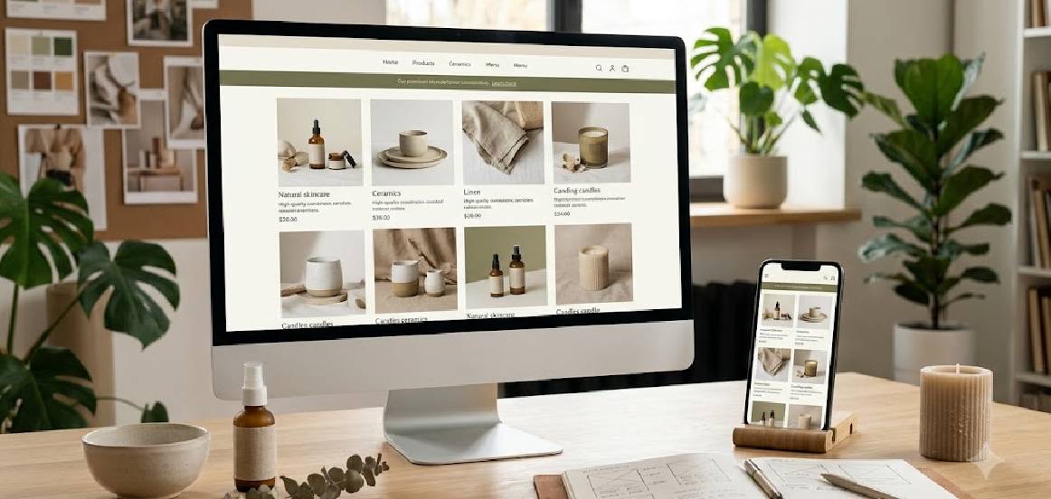
5. Create a Consistent Layout for Product Cards
Product cards appear throughout an online store, including category pages, search results, recommended products and homepage collections.
When these cards use inconsistent image sizes, title spacing, price positions or button styles, browsing becomes less comfortable. Products may also appear unevenly aligned within the grid.
Create a reusable product card layout that defines the position of each element.
A typical card may contain:
- Product image.
- Product name.
- Price and applicable sale price.
- Selected rating information, if available.
- Relevant product labels.
- Add-to-cart or view-product action.
Not every store needs every element. The design should prioritise information customers need to compare products.
Keep image containers consistent even when products have different physical proportions. A tall bottle and a wide box can occupy the same image area while maintaining appropriate whitespace around each product.
Also define how long product names wrap, where sale labels appear and how buttons behave on mobile devices.
For stores built with WooCommerce or Shopify, reusable product card settings and templates can help maintain the same appearance across category pages and related-product sections.
The result should be a catalogue that feels organised while allowing individual products to remain visually distinct.
6. Design Product Pages With a Repeatable Structure
A product page should help customers understand what they are buying, review relevant details and decide what to do next.
If every product page presents information differently, customers may need to relearn the layout as they browse. A repeatable structure makes the shopping experience more predictable.
Consider a standard product page arrangement that includes:
- Product gallery.
- Product title and price.
- Available variants and options.
- Short product summary.
- Primary purchase action.
- Detailed description and specifications.
- Delivery, returns or care information where relevant.
- Reviews or related products, if applicable.
The exact structure depends on the product category. Clothing may need size selection and fit information, while electronics may require specifications and compatibility details.
Use consistent heading styles, spacing, image galleries and button treatments across comparable products.
At the same time, avoid forcing every product into an identical content length. Some products require detailed explanations, while others can be described clearly in fewer words.
A reusable template provides consistency without removing the flexibility needed to communicate product-specific information.
Review the complete page on desktop and mobile to ensure that important details remain easy to find.
7. Coordinate Homepage Banners With the Rest of the Store
The homepage often introduces customers to the brand’s visual identity. A banner that uses unrelated colours, different photography and inconsistent typography can make the store feel disconnected from the product catalogue.
Design banners using the same visual principles as the rest of the website.
Start by identifying the purpose of each banner. A seasonal campaign may promote a collection, while a brand banner may communicate the store’s overall positioning.
Then consider how the banner relates to:
- The primary brand palette.
- Product photography style.
- Heading and button typography.
- Product category imagery.
- Spacing and alignment.
- Mobile layout and cropping.
Avoid treating every campaign as a completely new design project. Build reusable banner templates with defined text placement, image treatment and button styles.
For example, a stationery store can use different product collections in its banners while maintaining consistent typography, background treatments and button design.
Also check how the banner appears on smaller screens. A wide desktop image may crop out important products or leave too little room for the headline on mobile.
A coordinated banner system helps the homepage feel like a natural extension of the store rather than a separate promotional page.
8. Maintain Consistency in Buttons, Icons and Interactive Elements
Visual consistency also applies to the elements customers interact with.
Buttons, icons, dropdowns, quantity selectors and product labels should follow predictable styling rules. If each section uses a different button shape, border treatment or icon style, the interface may feel unfinished.
Create a small component system that defines how common elements should appear.
For example, establish standard rules for:
- Primary and secondary buttons.
- Button heights and corner radii.
- Border colours and thickness.
- Icon size and stroke style.
- Form fields and dropdowns.
- Sale and new-arrival labels.
- Hover, focus and disabled states.
Use colour and contrast to distinguish important actions. A primary purchase button should be easy to identify without making every secondary action equally prominent.
Icons should also be consistent in style. Mixing thin outline icons with heavily filled illustrations can make the interface feel less cohesive.
Remember that appearance and usability work together. Buttons should have clear labels, sufficient clickable areas and visible focus states for keyboard users.
A consistent component system helps customers recognise familiar controls as they move between the homepage, category pages, product details and checkout.
9. Keep Promotional Graphics and Sale Labels on Brand
Promotional graphics can introduce urgency or highlight offers, but inconsistent campaign designs can disrupt the store’s visual identity.
For example, if one sale banner uses bright red, another uses neon green and a third uses a completely different font style, the overall website may feel less coordinated.
Create a promotional design system that defines how discounts, seasonal campaigns and special collections should appear.
Standardise elements such as:
- Promotional colour combinations.
- Font styles and hierarchy.
- Discount label placement.
- Banner proportions.
- Button treatments.
- Product image presentation.
- Spacing around promotional messages.
You can still use campaign-specific colours when they serve a clear purpose. The key is to introduce them deliberately and retain recognisable brand elements.
Make sure promotional graphics communicate accurate offers and do not hide essential product information. Sale prices, discount conditions and relevant limitations should be clear wherever applicable.
Avoid adding decorative elements that compete with the product. A promotional banner should guide attention toward the offer, not make the page difficult to understand.
A consistent approach helps seasonal campaigns stand out while preserving the identity customers recognise across the store.
10. Use Lifestyle Images That Match Your Brand’s Personality
Lifestyle photography shows products in relevant settings rather than presenting them only against a plain background.
These images can help customers understand product scale, use and context. However, the styling should match the brand’s broader visual identity.
For example, a premium home decor store may use natural materials, soft lighting and carefully styled interiors. A sports accessories store may prefer energetic scenes and outdoor environments.
The individual photographs can vary while still sharing common visual characteristics.
Consider defining guidelines for:
- Lighting mood.
- Background and location style.
- Prop selection.
- Model direction, where relevant.
- Colour treatment.
- Product visibility.
- Composition and framing.
Lifestyle images should complement catalogue photography rather than replace the clear product views customers need.
It is also important to represent products accurately. Avoid editing that changes important product characteristics or using a scene that gives customers a misleading impression of size, colour or functionality.
When lifestyle imagery follows a consistent direction, it adds personality to the store without making the product catalogue feel fragmented.
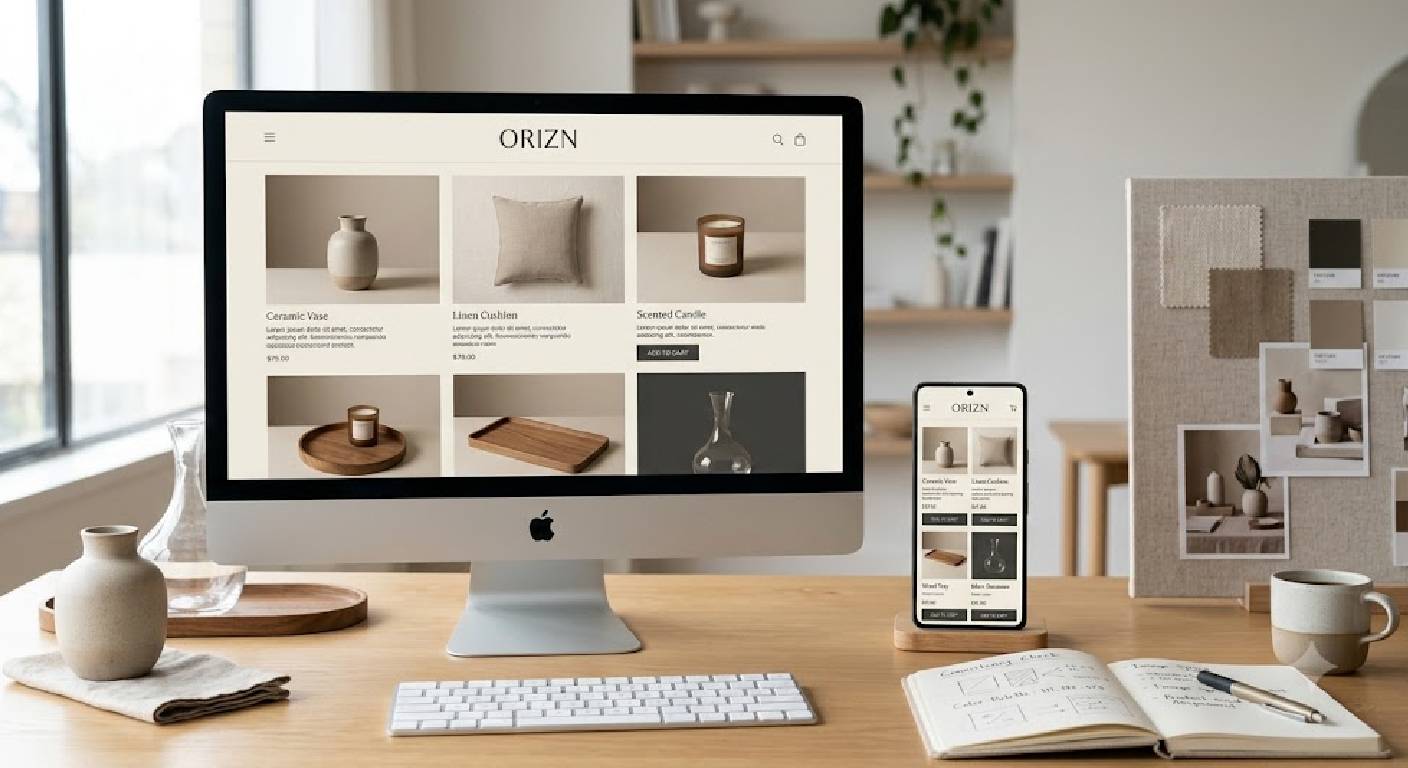
11. Optimise Images Without Losing Visual Quality
Large image files can slow down an e-commerce website, particularly for customers browsing on mobile connections. At the same time, excessive compression can make product images look blurry or reduce important detail.
The goal is to balance image quality with performance.
Start by preparing images for their intended display dimensions. Uploading extremely large files when a smaller version would be sufficient can add unnecessary weight to the page.
Consider these practices:
- Resize images to appropriate display dimensions.
- Use modern formats such as WebP or AVIF when supported.
- Compress files while checking visual quality.
- Use responsive image sizes where possible.
- Avoid loading unnecessary full-resolution images.
- Enable lazy loading for suitable below-the-fold images.
- Provide meaningful alternative text for informative images.
Product images should remain sharp enough to communicate details such as material, finish and texture. Test the results on both desktop and mobile devices.
Also check that compression does not introduce visible artefacts around product edges or alter important colours.
Image optimisation should be part of the store’s regular workflow rather than a task performed only after the website becomes slow.
12. Create a Cohesive Mobile Shopping Experience
A store that looks consistent on desktop may feel very different on a mobile screen. Banners can crop incorrectly, product cards can become cramped and typography may become difficult to read.
Because mobile visitors have less screen space, the design needs to adapt carefully while preserving the same brand identity.
Review these areas on mobile devices:
- Header and navigation.
- Logo size and placement.
- Product grid spacing.
- Image proportions.
- Heading and body text.
- Button size and position.
- Product variant selectors.
- Cart and checkout interfaces.
- Banner cropping and text placement.
Avoid shrinking the entire desktop design to fit a phone. Instead, rearrange content so that the most important information remains easy to find.
For example, a four-column desktop product grid might become a two-column mobile grid, with image containers and card spacing adjusted accordingly.
Buttons should remain comfortable to tap, and important product details should not require excessive scrolling or zooming.
Test real pages, not just the homepage. Category listings, product details, search results and checkout can each present different mobile usability challenges.
A responsive design system helps the store maintain a recognisable appearance across screen sizes without sacrificing usability.
13. Align Website Design With Your Product Photography Workflow
Website design and product photography are closely connected. An image that looks excellent as a full-width photograph may not work well inside a tightly cropped product card.
Planning photography without understanding the website layout can lead to inconsistent crops, missing product details and unnecessary editing.
Before a photoshoot, identify how the images will appear on the website.
Share details such as:
- Product image container dimensions.
- Expected aspect ratios.
- Background requirements.
- Product positioning.
- Space needed for cropping.
- Mobile and desktop display requirements.
- Need for close-up and lifestyle images.
If the store uses square product cards, ensure that the photography can accommodate that format without cutting off important parts of the product.
Different categories may need different image rules, but those rules should be defined before the shoot.
Coordination is especially useful when a business is launching a new store or redesigning an existing one. Photographers and developers can plan the image requirements together instead of adjusting every photograph after upload.
MW Stuudio offers product photography in Mumbai alongside e-commerce development services, making it a relevant option for businesses that need coordinated visual content and store design.
14. Build a Repeatable Visual Quality-Control Checklist
Even with a design system in place, visual inconsistencies can appear as the store grows. New products may be uploaded with different image dimensions, campaign graphics may use outdated colours and newly created pages may follow older templates.
A quality-control checklist helps identify these issues before they affect the customer experience.
Review the store regularly and check:
- Product images follow the relevant category guidelines.
- Colours and typography match the current brand system.
- Product cards align consistently.
- Banners display correctly on desktop and mobile.
- Buttons and icons use approved styles.
- Product pages follow the expected structure.
- Promotional labels are consistent and accurate.
- Images load properly and remain visually clear.
- Important product details are easy to find.
- No broken images or unexpected layout shifts appear.
For stores with large catalogues, prioritise the most visited categories and products before reviewing less frequently accessed pages.
It is useful to assign responsibility for the final visual review. When several people publish content, a shared checklist reduces reliance on individual memory.
Schedule additional checks after theme updates, major campaigns, catalogue imports or website redesigns.
A repeatable review process helps maintain consistency as the business adds products and introduces new content.
15. Measure, Review and Improve the Visual Experience
Creating a consistent store is not a one-time task. Product ranges expand, marketing campaigns change and customer expectations evolve. Regular reviews help businesses maintain the visual system while identifying opportunities for improvement.
Begin by checking the store as a customer would. Browse the homepage, open several category pages, compare product details and proceed through the cart experience.
Look for visual differences that feel accidental rather than purposeful.
You can also review relevant website metrics to understand where customers may be experiencing difficulty. For example, product-page engagement, mobile navigation behaviour, image loading performance and checkout completion may provide useful context.
These metrics do not prove that a visual design change caused a particular outcome. They should be interpreted alongside usability observations, customer feedback and any other changes made during the same period.
Consider testing one improvement at a time where practical. A business might standardise product image proportions, improve mobile spacing or simplify the visual hierarchy on a product page.
Document the change and review whether the intended experience improves.
It is also worth collecting feedback from people unfamiliar with the website. Ask them to locate a product, compare two options and identify important product details. Their experience may reveal inconsistencies that the internal team overlooks.
A consistent visual experience should remain flexible enough to improve while retaining the core identity of the brand.
Conclusion
Creating a consistent visual experience across your e-commerce store requires coordination between brand identity, product photography, website layouts, typography, colours and technical performance.
The process begins with a clear visual direction. From there, businesses can standardise product images, create reusable product cards, organise product page layouts and align promotional graphics with the wider brand identity.
Mobile responsiveness and image optimisation are equally important. A store should remain visually coherent across devices while keeping product information clear and pages easy to use.
Consistency also requires an ongoing process. Reusable design components, photography guidelines and quality-control checklists help teams maintain the same standards as the catalogue grows.
Most importantly, consistency should support the shopping experience rather than restrict creativity. Different products and campaigns can have distinct visual styles as long as they follow a coherent set of brand principles.
For businesses planning a new e-commerce store or improving an existing one, coordinated photography and website development can help establish a stronger visual foundation. MW Stuudio offers e-commerce photography and development services that businesses can explore according to their requirements.
A well-designed online store is not simply a collection of attractive pages. It is a connected experience in which every image, colour, layout and interaction helps customers understand the brand and navigate the products with confidence.