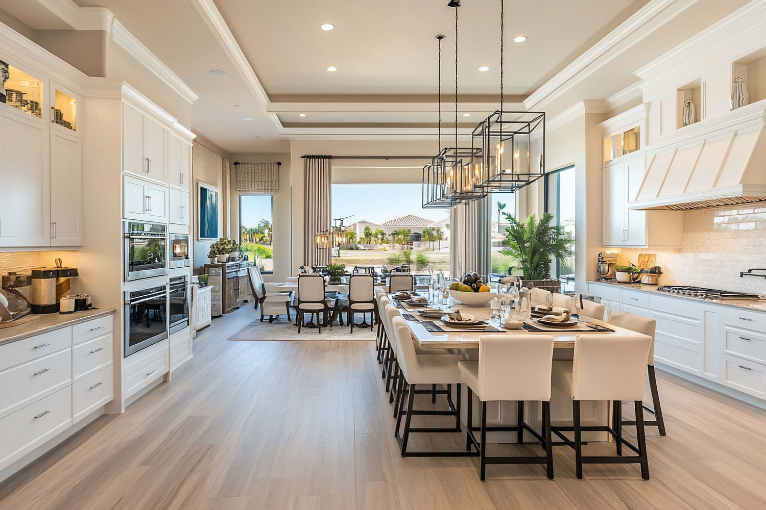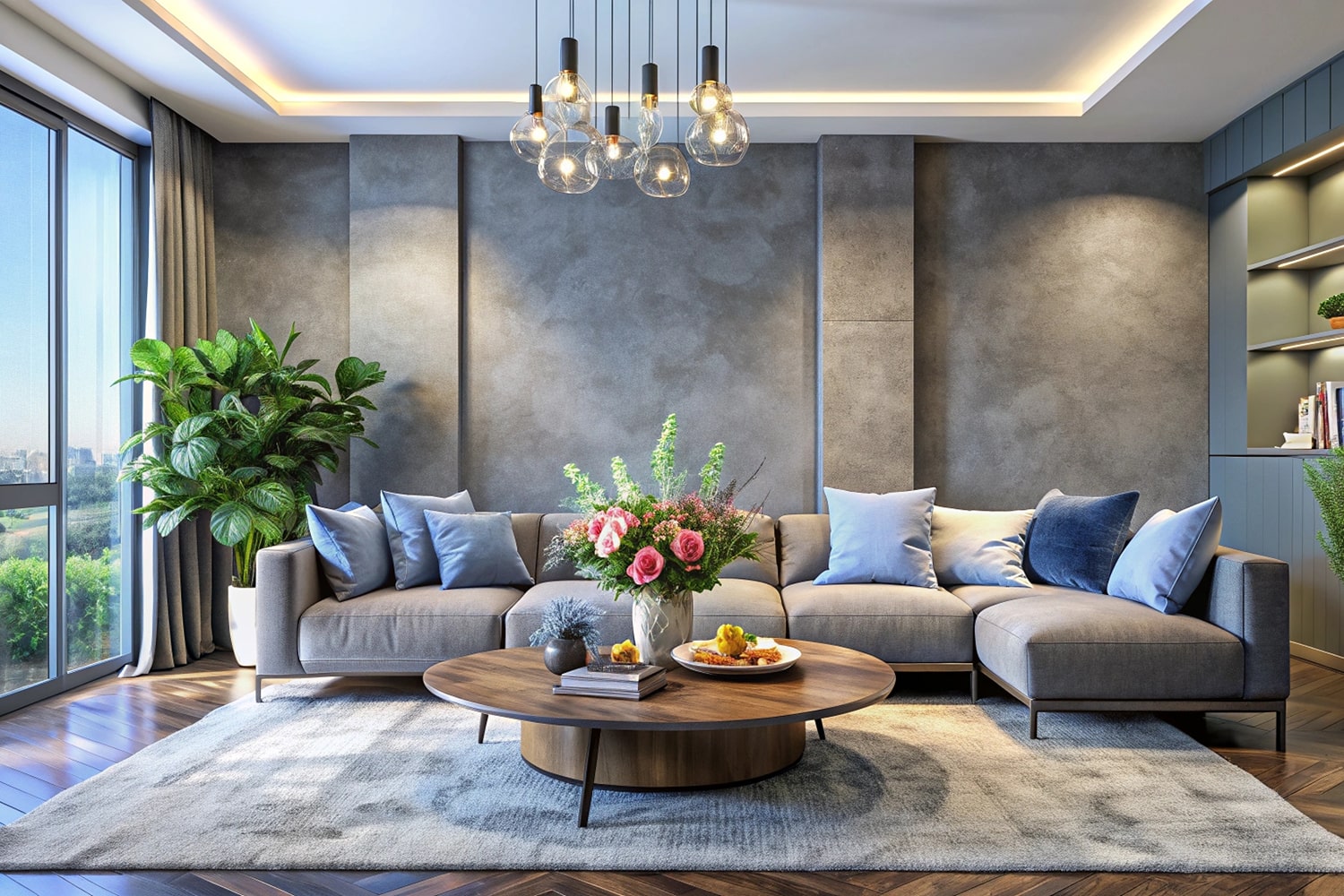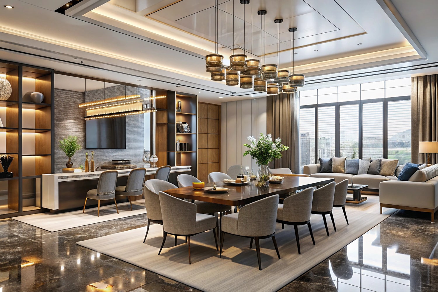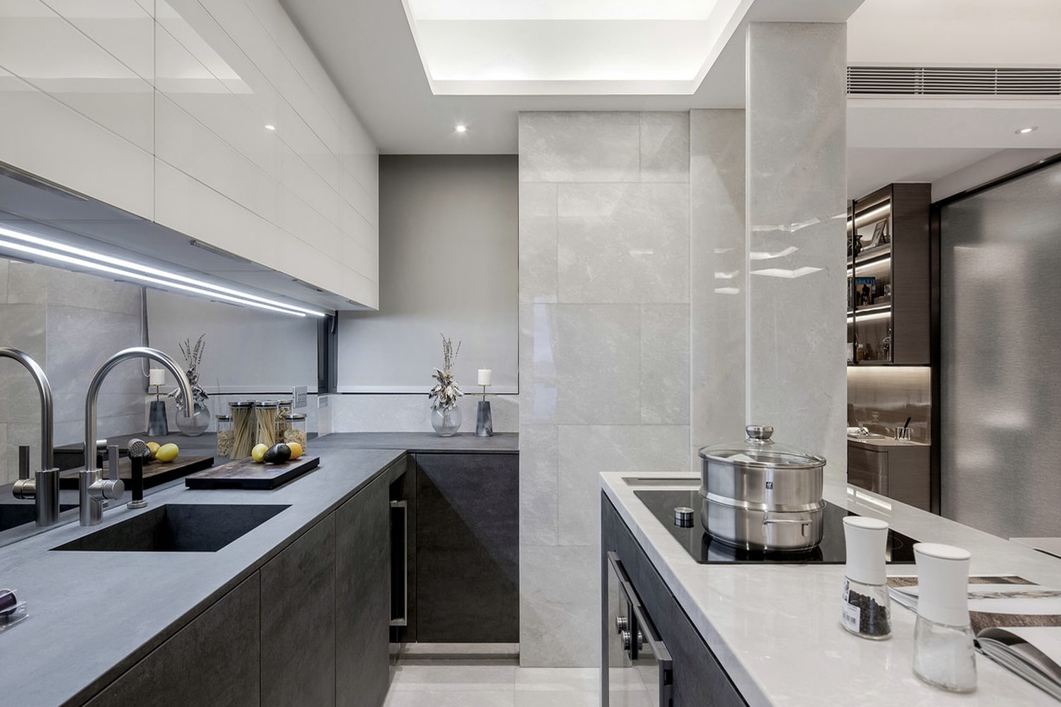

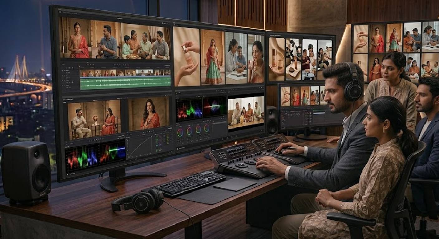
A strong visual identity is about more than a logo, brand colours, or typography. Every photograph, video, Reel, advertisement, product image, and piece of visual content contributes to how people perceive a brand.
When visual content is produced across different locations, cameras, lighting conditions, photographers, videographers, and production days, maintaining a consistent appearance can become challenging. One video may look warm and cinematic, another may appear cool and flat, while another may have noticeably different skin tones or contrast.
This is where colour grading becomes an important part of professional visual content production.
Colour grading allows a creative team to establish a deliberate visual treatment for video content. It can help create consistency between shots, support a particular mood, strengthen visual storytelling, and make different pieces of content feel like part of the same brand.
Colour grading is especially valuable for businesses producing content regularly. A brand that publishes Reels every week, creates YouTube videos, records podcasts, produces advertisements, or publishes corporate videos needs a visual system that can remain recognisable across different content formats.
MW Stuudio includes colour grading within its post-production services, alongside video editing, sound design, motion graphics, subtitles, thumbnail design, and photo retouching. Its current Reel production workflow also describes consistent colour treatment across batches of content.
1. Colour Grading Helps Create a Recognisable Visual Style
A brand’s visual identity should extend beyond static design elements.
If someone watches one of your videos without seeing the logo, the visual treatment should still feel compatible with your brand.
Colour grading can contribute to this recognition.
A brand might choose a visual style that feels:
- Clean and modern
- Warm and welcoming
- Premium and sophisticated
- Bold and energetic
- Natural and authentic
- Cinematic and dramatic
- Minimal and neutral
The objective is not to make every video look identical.
Instead, colour grading creates a visual relationship between different pieces of content.
For example, a fashion brand may use accurate but slightly polished colours, while a corporate consulting company may prefer clean neutral tones.
Once the preferred visual treatment has been established, it can become part of the brand’s content guidelines.
2. Colour Correction and Colour Grading Serve Different Purposes
Colour correction and colour grading are related but they are not exactly the same process.
Colour correction focuses primarily on technical consistency.
It can involve correcting:
- Exposure
- White balance
- Contrast
- Colour temperature
- Skin tones
- Camera differences
- Lighting inconsistencies
The objective is to make the footage look technically balanced.
Colour grading comes after that foundation.
It focuses more on the creative appearance of the footage.
For example, an editor might use grading to create:
- Warmer highlights
- Cooler shadows
- Softer contrast
- Stronger contrast
- Muted colours
- Richer tones
- A specific cinematic mood
A professional workflow often starts with correction and then moves toward creative grading.
This distinction matters because a creative look cannot compensate for footage that has inconsistent exposure or incorrect white balance.
3. Consistent Colour Makes Different Camera Shots Feel Connected
Professional productions may use multiple cameras.
Different cameras can capture colour differently even when they are recording in the same environment.
One camera might produce slightly warmer skin tones while another may appear cooler.
There may also be differences caused by:
- Camera profiles
- Lenses
- Exposure
- White balance
- Lighting position
- Sensor characteristics
- Picture profiles
Without correction, switching between cameras can make the video feel inconsistent.
Colour grading helps bring those shots closer together.
This is particularly important for:
- Podcasts
- Interviews
- Corporate videos
- Events
- Product videos
- Brand films
- Multi-camera productions
MW Stuudio’s current podcast production workflow includes multi-camera editing and colour grading for video episodes.
The goal is to make camera changes feel natural rather than visually distracting.
4. Colour Grading Can Strengthen Brand Personality
Every brand has a personality.
Some brands feel energetic.
Some feel sophisticated.
Some feel youthful.
Some feel traditional.
Some feel premium.
Some feel approachable.
Colour can support these characteristics.
A warm colour treatment may create a more welcoming or lifestyle-oriented feeling.
Neutral tones may communicate a clean and professional appearance.
Higher contrast may create a stronger and more dramatic visual character.
Softer contrast and natural colours may work well for brands that want a calm and authentic appearance.
However, the colour treatment should be connected to the brand rather than selected simply because it is currently fashionable.
Trends change.
A consistent visual identity should be able to remain useful beyond a short trend cycle.
5. Consistent Skin Tones Are Essential for People-Focused Content
Many business videos include people.
This includes:
- Founder videos
- Interviews
- Podcasts
- Testimonials
- Reels
- Corporate videos
- Personal branding
- Educational videos
- Advertising content
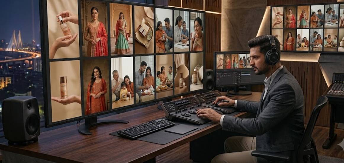
Skin tones are particularly sensitive to changes in lighting and colour treatment.
If skin appears too orange, too red, too green, or unusually pale, viewers may notice that something looks unnatural even if they cannot identify the technical reason.
Professional colour correction helps maintain natural-looking skin tones before creative grading is applied.
The final look should enhance the overall image without making people appear unrealistic.
This is especially important for personal brands, fashion content, beauty businesses, healthcare professionals, and corporate videos where people are the main visual focus.
6. Colour Grading Helps Different Shooting Locations Feel Like One Brand
Businesses do not always shoot all their content in the same location.
A company might record:
- An interview in a studio
- A product video in a showroom
- A Reel in an office
- A corporate video at its facility
- A lifestyle campaign outdoors
Each location naturally has different lighting and colours.
Outdoor daylight can look very different from indoor LED lighting.
A showroom may have warm artificial lights, while an office may have cooler overhead lighting.
Colour correction and grading can help create a more consistent visual relationship between these different environments.
This does not mean every location should look exactly the same.
Instead, the footage can share certain visual characteristics that make it feel connected to the same brand.
7. Colour Grading Can Improve Product Presentation
Product content requires careful colour management.
For many products, colour accuracy is important.
This is particularly true for:
- Fashion
- Cosmetics
- Jewellery
- Food
- Furniture
- Consumer products
- Electronics
- Lifestyle products
A product that appears significantly different in a video from its actual appearance can create confusion for customers.
This is why professional production should distinguish between creative grading and colour accuracy.
A brand may want a polished visual style while still needing the product itself to remain accurately represented.
MW Stuudio’s photography post-production workflow specifically includes colour correction and grading, with product photography workflows designed to maintain accurate product colours.
For product-focused brands, colour decisions should therefore be made carefully rather than simply applying a strong cinematic filter.
8. A Consistent Colour Treatment Can Strengthen Social Media Content
Social media is one of the most visible places where a brand’s visual identity appears.
A viewer may see several pieces of content from the same business within a short period.
If every Reel has a completely different colour treatment, the content can feel disconnected.
A consistent grading approach can help create continuity across:
- Instagram Reels
- YouTube Shorts
- LinkedIn videos
- Facebook videos
- Website videos
- Paid advertisements
This is particularly useful for brands that produce content in batches.
For example, if 15 Reels are recorded during one production session, applying a consistent colour treatment can make the entire batch feel like one professional content series.
MW Stuudio’s Reel production pages specifically describe consistent branded colour treatment across batches of Reels.
9. Colour Grading Supports Visual Storytelling
Colour is not only about making footage look attractive.
It can also support storytelling.
Different parts of a video may require different emotional treatments.
For example:
A business success story might begin with darker or more restrained visuals and gradually become brighter.
A lifestyle campaign might use warm colours to support a relaxed atmosphere.
A corporate film might use neutral, controlled colours to maintain a professional tone.
A dramatic brand film might use stronger contrast to create intensity.
Colour should therefore support the narrative rather than exist separately from it.
When used carefully, colour becomes another storytelling tool alongside camera movement, music, editing, lighting, and composition.
10. Colour Grading Can Give Different Content Formats a Shared Identity
Modern brands rarely use only one type of content.
A business may have:
- Podcasts
- Reels
- YouTube videos
- Product videos
- Corporate films
- Testimonials
- Interviews
- Advertisements
- Website videos
These formats may have different production requirements.
However, they can still share a visual language.
For example, a brand could establish:
- Natural skin tones
- Slightly warm highlights
- Controlled contrast
- Consistent saturation
- Clean whites
- A specific shadow treatment
These principles can then be adapted to different types of content.
The podcast does not need to look exactly like the product advertisement.
But both can still feel like they belong to the same brand.
This is particularly valuable for businesses building a large content library.

11. Colour Grading Can Improve the Perceived Production Quality
Colour grading does not automatically make poor footage professional.
However, when the production foundation is strong, thoughtful grading can make the final content feel more polished.
Balanced exposure, controlled contrast, consistent colours, accurate skin tones, and intentional visual treatment can all contribute to a finished appearance.
This becomes particularly noticeable when comparing raw footage with the final edited version.
The difference is often not one dramatic effect.
Instead, it is a collection of small improvements:
- More balanced highlights
- Better shadow detail
- Consistent skin tones
- Controlled saturation
- Matching camera shots
- More intentional contrast
- Better overall visual balance
These details can make a video feel more complete.
MW Stuudio includes colour grading within its professional post-production workflow for video and Reel content.
12. A Colour Grading Style Can Become Part of Your Brand Guidelines
If colour consistency is important to your business, document it.
Your brand guidelines do not have to cover only logos, fonts, and graphic colours.
They can also include visual content guidelines.
For example, a video style guide could define:
Skin Tones: Natural and realistic.
Saturation: Moderate and controlled.
Contrast: Medium with preserved shadow detail.
Highlights: Clean and controlled.
Overall Temperature: Slightly warm.
Product Colours: Accurate and natural.
Social Content: Consistent treatment across the batch.
These guidelines help different editors, videographers, and agencies understand the visual direction.
As a brand grows, this becomes increasingly useful.
If five different people create video content for the company, they should still have a shared understanding of how the final content should look.
13. Colour Grading Works Best When Planned During Production
Colour grading happens during post-production, but its success depends partly on decisions made before and during the shoot.
Production teams should consider:
- Lighting
- Camera profiles
- Exposure
- White balance
- Background colours
- Wardrobe
- Product colours
- Location
- Camera matching
Shooting with appropriate exposure and suitable camera settings gives the editor better material to work with.
Lighting is especially important.
A dramatic colour grade cannot reliably fix badly mixed lighting or severely incorrect exposure.
This is why professional production and post-production should be treated as connected stages.
MW Stuudio’s production ecosystem combines shooting with post-production, while its post-production services are also available separately for clients who have already filmed their content elsewhere.
Good planning gives the colourist more flexibility and helps the final visual style remain consistent.
14. Consistent Colour Grading Makes Batch Content Feel More Professional
Many businesses now produce content in batches.
Instead of recording one Reel every few days, a brand might shoot 10–15 Reels in one production session.
Similarly, a podcast may record several episodes during one studio session.
Batch production is efficient, but it creates another challenge: the content needs to look like a cohesive collection.
A consistent colour grade helps solve this.
If every Reel from the batch has similar exposure, skin tones, contrast, saturation, and overall treatment, the content can feel like a deliberately produced series.
MW Stuudio’s current Reel production services describe batch-based content production and consistent colour treatment across the full batch.
This can be particularly valuable for brands that want their social media content to have a recognisable visual character.
15. Build a Repeatable Colour Workflow for Long-Term Brand Consistency
The biggest value of colour grading comes when it becomes a repeatable process.
A useful workflow can look like this:
Shoot → Organise Footage → Colour Correction → Camera Matching → Skin Tone Correction → Creative Grade → Brand Look → Review → Export
The same principles can then be applied to future content.
This does not mean every project should receive exactly the same grade.
Different locations, products, seasons, campaigns, and stories may require adjustments.
Instead, the brand should have a consistent foundation.
For example:
Core Brand Look: Clean, natural, premium.
Campaign Variation: Warmer for lifestyle campaign.
Product Variation: More colour-accurate for e-commerce.
Corporate Variation: Neutral and professional.
Podcast Variation: Natural skin tones with consistent studio contrast.
This gives the brand flexibility without losing its identity.
Over time, a consistent colour workflow can become an important part of the wider content production system.
MW Stuudio’s broader creative ecosystem brings together photography, video production, post-production, podcast production, content writing, websites, SEO, and digital marketing, which can help brands approach visual consistency as part of a wider content strategy rather than as an isolated editing task.
Conclusion
Colour grading can play an important role in creating a consistent visual identity for your brand.
It can help different camera shots feel connected, support natural skin tones, improve product presentation, strengthen brand personality, create consistency across social media, and establish a recognisable visual treatment across different content formats.
However, effective colour grading is not simply about applying a cinematic filter.
Professional colour work begins with technically balanced footage and then uses creative decisions to support the brand’s personality and story.
For businesses producing regular visual content, a repeatable colour workflow can be particularly valuable.
The same visual principles can be applied to Reels, podcasts, corporate videos, product videos, interviews, advertisements, and other content while still allowing each format to have its own character.
MW Stuudio offers colour grading as part of its post-production services, alongside video editing, sound design, motion graphics, subtitles, thumbnail design, and photo retouching. Its current Reel production workflow also uses consistent colour treatment across content batches.
The goal is not to make every piece of content look exactly the same.
The goal is to make every piece of content feel like it belongs to the same brand.